 mmm, its taken me a couple of days to get my thoughts together around this years Supersonic Festival. First up, I enjoyed it a lot. But, it seemed to end on a bit of a low for me and It didn’t seem as if I’d enjoyed it as much as I did last years weekend, nor the years before and I couldn’t really work out why. Actually, I’m not really sure you should compare one years to another, like most people I think my memory tends to improve on the reality highlighting the good and toning down the bad, but I couldn’t help myself, so here goes;
Tonight I was sat in my local arts centre, watching a band from the early sixties go through their paces, with a pint of beer at £2.10 [rather than £4.00!!!] and immaculate toilets [rather than, well, less said the better] Seven days before I’d been watching Light Trap, Thorrs Hammer and Monotonix. While the music I was sat watching, with my reasonably priced pint, was good, at some times it felt like watching a pub band, and not a good one at that. During the pub band moments I got my thoughts together on what I enjoyed, what I didn’t and why from the Supersonic weekend.
Read More
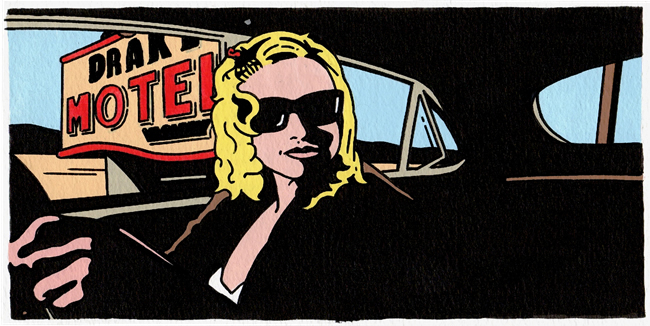
![]() couple of my older illustrations are currently featured on The Rumpus dot net website. They feature to illustrate a short story titled ‘Exactly Like Liz Phair, Except Older. And With Hypochondria’ by Dan Kennedy.
couple of my older illustrations are currently featured on The Rumpus dot net website. They feature to illustrate a short story titled ‘Exactly Like Liz Phair, Except Older. And With Hypochondria’ by Dan Kennedy.


Are you talking to me?
Chris
"Hi Jane. I do still have this painting and sent a reply to ..."
Jane Lumb
"Do you still have this painting for sale? I’m interested in paintings of ..."
Chris
"Hey TJ, (& everyone else who posted since I last logged in here.) I ..."