 t was great to be asked to work with a previous client on on the set up of a brand new project.
Mengage is a UK-based not-for-profit company working with males on health and social issues, providing resources, training, consultancy and practical research-based solutions from both national and international practice, backed by years of experience of practical work with men and boys.
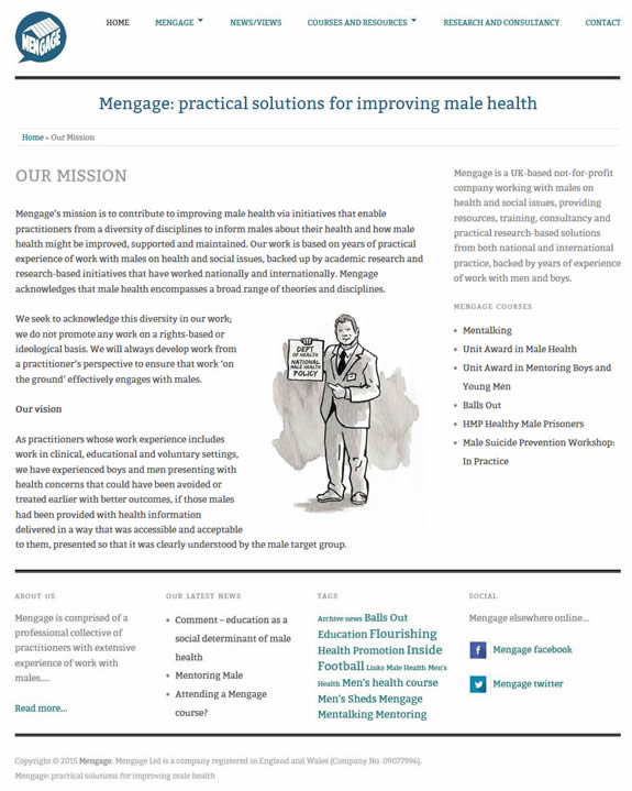
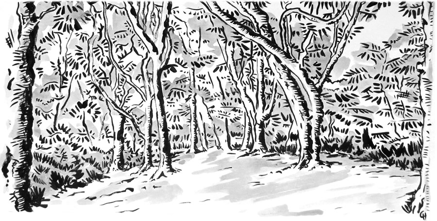
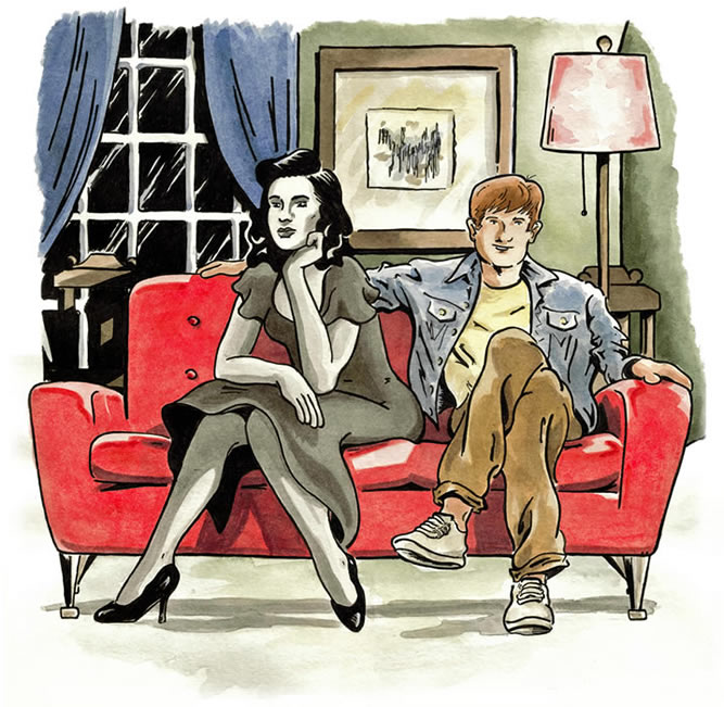
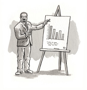 I contributed both the website, logo and some illustrations to the project. The illustrations were produced both to be used on the website itself and in a number of print publications.
I’ve wanted to have the opportunity of placing some illustrations within a website layout for some time, stock images are fine but they can sometimes feel, and be, a little generic and forgettable. I think where the illustrations appear within the new website they do help to give the project and a little more depth and a more unique visual identity. The logo was also produced as a metal badge, cut to shape to help with promotion and identity, it came out really well.
Anyway, click here to visit Mengage, If you are putting a project together, do consider illustration along side stock photography, I may well be biased but I think its an underused option.
![]() rm, Happy New Year?
rm, Happy New Year? 
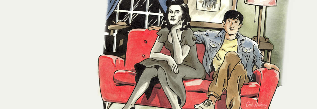
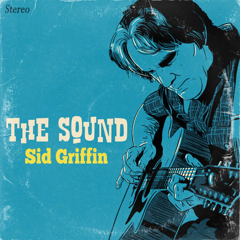
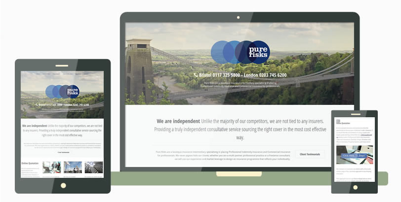
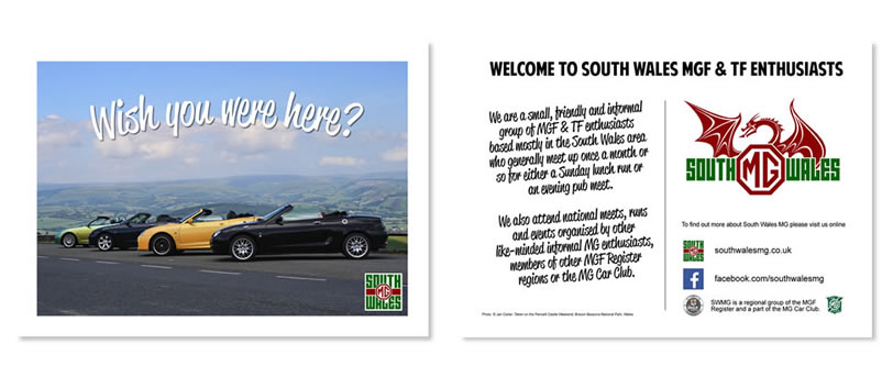
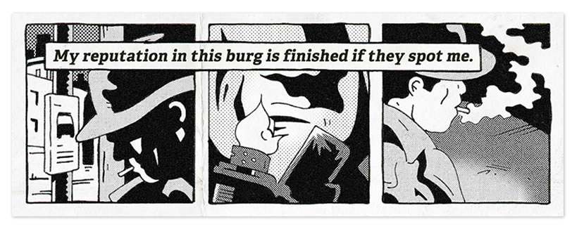
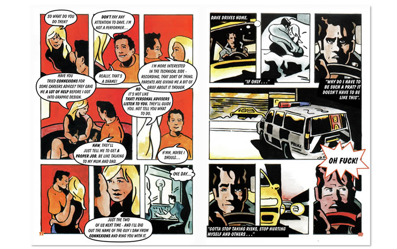
 I contributed both the website, logo and some illustrations to the project. The illustrations were produced both to be used on the website itself and in a number of print publications.
Are you talking to me?
Chris
"Hi Jane. I do still have this painting and sent a reply to ..."
Jane Lumb
"Do you still have this painting for sale? I’m interested in paintings of ..."
Chris
"Hey TJ, (& everyone else who posted since I last logged in here.) I ..."